Saturday, 11 April 2009

Northumberland


We went up to Northumberland last weekend. Amazing coast and loads of Castles. There everywhere. This shot was from Holy Island car park of Lindisfarn. I was lucky enough to be there as a storm brewed and sunlight lit up the castle really nicely. I love the tree in the foreground but I think it's a little confusing as it draws your eye away from the castle... I'll drop it out in the week when I have my tablet. I also like the black wall pointing towards the castle and the birds flying around.


The wind was incredible on the first day. The picture above captures it, I've never seen anything like it. It was like we were standing in the sea. I like the crop above with the sharp streak of black sea pointing to the people in the distance. Hopefully more to come....

Tuesday, 10 March 2009

Square or not?

At the end of Project 6 cropping the same image in varying ways comes up. I try different crops for most shots, probably down to Graphic Design, but I find I may be relying on Photoshop rather than getting it bang on straight from the view finder. Problem is I love 6x6 format images, not sure why but they always stick out to me. Again with Graphic design I'm used to working with a square for a sleeve. I'm waiting on a new focusing screen for my SLR with a grid of 3rds so I'm hoping this will help me out... Here's an image I shot with a square format in mind. It works OK for the original un-cropped image but I like the symmetry the square formate creates on the sea view. For the waterfall, again, the symmetry works for me. One thing I wonder is if the rule of 3rds works the same with a square format?


Square


Original


Square


Original

Both waterfall shots {f22, 30 seconds, iso100} around midnight with a bloody great big light.

Saturday, 7 March 2009

Mixed Projects at Mersea Island


We went to Mersea Island today, unfortunately I only took my compact with me but the visit has inspired me to go there again ASAP. I want to follow up on at least 3 or 4 shots here. There's a lot here and I've tried to think of many of the projects, this will also be another image sequence for Project 8 to be finished shortly.

I've tried to think of placing objects in varying positions in the fame (Project 7), the framing of the image (Project 6) and the balance of objects in the frame (Project 11, 12 and 13). I want to cover some of the later projects in a lot more detail but felt this was an OK thing to do, ultimately I will need to have all of these theories in mind to create better images in the future.

I've got to say I found the compact really nice as I didn't have to think about many settings. This made for a nice flow. It's been good to look at and see images within these waiting to be taken with a little more care and attention using my SLR and a tripod etc...

Here we go...


Friday, 6 March 2009

Project 8

Recording a sequence.

Following from Project 9's images this is where I went... I found this interesting afterwards. Odd. It seemed silly.

Again, I'm rushing through this blog as I really need to get on with the course and not worry so much about it all. It's all still a little uncomfortable learning in a structured manner.


And my final image!

{f7.1 - 1/50 - iso400}

Not exactly the same as the images in the course material but interesting to me to see where I ended up. Alot more abstract than I'd expected. nice!

Thursday, 5 March 2009

Project 9

This was a quick project using the various focal lengths I can achieve with the lenses I have.

28mm

70mm

200mm


400mm

I've used this scene as I was there for another project to be honest. The sun was above and behind the shell building in the 400mm shot so it wasn't the best time for the photos. I've also been struggling getting back in to the project since xmas so I really needed to get a move on.

In the end I prefer the first image (28mm) for the foreground detail. I understood that I can get different images from one scene with various focus lengths so this was a bit of a dull project for me TBH. Also I could have done with a 800mm to zoom right in on the angel above the door on the shell building.

This was shot in Hatfield Forest.

Project 7

Needed to get cracking! Objects in different positions in the frame.


Centered in the frame


A little off center


close to the edge

Centered

A little way off centered

Close to the edge

On the pictures of Sammy my dog I preferred the image where Sam is close to the edge. this is helped by her pose i think, looking in to the center of the image.

Again for the National Trust picture I preferred the object to be to the edge...

I found this a nice thing to try as I shoot. there 3 options that all have their own merits. Some will work better for different applications. I suppose as a graphic designer I like the space both of these preferred shots have created, perfect for some text!


Monday, 2 February 2009

Red Harry "Give me all your nuts"


Well we're snowed in at a cottage in Cumbria! Oddly email and internet work but the phones are dead and the roads are invisible.... Here's a picture of Harry the Red Squirrel. He's come every morning for a feed! More to come when I get home.... I'm still trying for one of him in the snow.


Saturday, 24 January 2009

Frosty fur


I have been working, honest... It's been 2 months since I last posted, not a good start but I've been away to the states and then Xmas and work commitments etc... Any how, back to it!

I'll ad more here shortly but here's the first image from the short break.

The cows have long since gone from the field across from me but there's still some evidence of their existence! They must have rubbed against the barbed wire and then left clumps of fur. I'd noticed this a while ago but with the new frosty weather I got the shot I wanted (First image in this post). I'm hoping this will be good enough for one of Assignment 1's images on contrasts. Here's one of the early shots...


More to follow soon...

Saturday, 15 November 2008

Apples!


Image 1; f7.1, 6", iso100, 105mm

I've been reading through "Photography, A concise history" and found a few images in there that really interest me. One was of an apple named, "untitled" or "Galaxy Apple" by Paul Caponigro 1972 (page 227, plate 125). Initially it looks like a really simple shot. When you look closer and then go and try it out, its a different story. His exposure is just spot on. The lighting and reflections are just enough to show you the apple is three dimensional and round and shiny, but still allows for the varying shades and bright spots to be in perfect balance. The spots have a really nice patter as they spread out over the skin from the cores centres. The background is lit either side to pick the apple out really nicely to, or maybe from behind?

So I decided to try this out. I really can't put into words how hard this has been. The end results are nowhere near as good as the ones Paul Caponigro produced but I had fun doing it and they let me play around with candles and a flash and other different lights to try and achieve the same sort of results as the original.


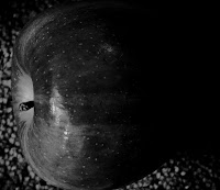
Image 2; f20, 25", iso400, 105mm

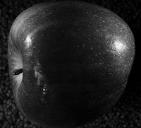
Image 3; f20, 25", iso400, 105mm

Image 4; f20, 30", iso400, 105mm

After looking at the images a little closer I wanted to play around with the image 4. It had a much smaller aperture and long exposure (f20, 30", iso400, 105mm) so the whole image is sharper and has more detail, this helped show more variation in the tones of the skin also. I did a little retouching to this, dropping a hair, dulling down the reflection and changing the levels to up the contrast.


Image 4; f20, 30", iso400, 105mm (retouched)

I felt this image is technically closer to the original, with the sharp edge to the apple, the background lit slightly to help bring the edges out. But the first image has a nice feel to it with the shallow DoF. it also looks a lot shinier. I'd taken time to block most of the light in the room so the highlights were less harsh in image 1 and I think it works well.

Also I found a 1:1 crop (square crop) worked best in my opinion, though my apple was very round rather than the oval one in the original by Paul Caponigro.

All in all I'm happy with the project! It also went very well with some cheese once I'd finished!

Tuesday, 11 November 2008

TAoP Project 3

Here are the images for project 3. This was to show the depth of field (from this point on I will refer to this as DOF) using different apertures. I've shot in B&W as it made it a little easer to see the effects of the aperture changes. Also I used a tripod and manual focus so I could ensure the same crop and focus point (the centre beam) each time.

Shot 1: f2.8, 1/4, iso400, 125mm

This showed a really narrow band of sharpness.

Shot 2: f8, 2", iso400, 125mm

A slightly larger band of sharpness.

Shot3: f16, 8", iso400, 125mm

Nearly all of the image is in focus but it still has a slight blur to the far edges.

Shot4: f32, 30", iso400, 125mm

Everything in focus, though at the cost of a 30 second shutter speed.

Here are the images again with the area of sharpness mapped out. running from f2.8-f32:


As I've mentioned before (project 2), the overall extremeness of the effects of these aperture changes change with the size/angle of lens and distance from the subject. The closer you are/tighter you focus the more dramatic the effect of the large aperture and small DOF. I'd like to look at this further to gain a greater understanding of how this works. I understand that setting a low f stop will give me a nice sense of depth and a hight f stop an overall sharp image, but I'm not entirely sure of the science behind it, yet! Hopefully this will come with practice or maybe further on in the course...

TAoP Project 2 cont...

I decided to try another 3 shots for this.... All shots were f2.8, 1/60, 70mm, iso1000

I like the first shot as again it has an obvious depth of field before and after the gravestone I've focused on. The others work fine but I found the textures on the 2nd gravestone away from you was the nicest. I noticed that because I was further away from the subject the area in focus at f2.8 was greater than on the lolly pop images (showing off the litchen and moss). The effect is a lot subtler but still draws the viewer to were you want them.

TAoP Project 2

So for this project I've taken some close ups of a lolly pop stand.
I found this was the best subject to hand to show the depth of field.


All shots were f2.8, 1/60, 105mm, iso250. In sequence I focused on a row at the top, a row in the middle and a row at the bottom. This close up showed me the depth of field very clearly (I'd had problems using a wide angled lens on distant subjects). I decided to try a different crop and orientation to see how it looked...

I much preferred this image as it showed the depth of field before and after the lolly pop that was in focus. This seems to have a better impact on this particular shot, especial as you can almost read the logo. When you zoom in on the image (click on it now!) you can just make out a band of in-focus dots in the wrappers print. I really needed a slightly smaller aperture to allow for the whole face of the lolly pop to be in focus, at f2.8 it's far to small an area.

As I mentioned, I'd encountered problems showing an obvious depth of field whilst either using a wide lens or distant subjects. When I zoomed in or got closer the effects of a large/wide aperture was a lot more effective... More on this in Project 3.

I've also noticed my images are looking a little dull and de saturated once uploaded... I'll need to look in to this. I'm guessing it's my new Adobe CS4 that need calibrating.

Thursday, 6 November 2008

TAoP Project 1

So here's the 3 images for project one!


The first image is at 12mm, second at 70mm and the third at 200mm
It was interesting to find that 70mm is almost exactly the same as your own eyes view.

I also found that 70mm with one lens was slightly different from 70mm on another. This change of lens also showed me there was a considerable difference in the light coming through these lenses (28-70 f2 and a 70-200 f2) I suppose looking at them there would be an obvious difference as one's compact and the other is huge. I'd just never thought about it before.

I'm awaiting the prints for these to see how that side works... I'm interested to see the optimum viewing point of the images produced.

I have to say that initially I'd thought this project would be a waste of time but inevitably I found a few things out about the lenses I have that I wouldn't have found otherwise. The 70-200 lens seems to produce an image with more contrast which is really nice when you shoot on a hi iso speed. I've attached an image of a brick wall that's got a really nice feel to (in my opinion) from this lens. It's had a little colour work in Photoshop but not to much. just a slow shutter speed and big aperture with a grainy fast ISO.

Friday, 31 October 2008

Hide That Can

After seeing the "Ghost Town? Empty Homes in London" on ITV and having a chat with another OCA student (see the comments to my "London's Empty Homes" post) I've just remembered a book called, "Hide That Can" by Deirdre O'Callaghan. It's a very true and open book containing some great portraits of the homeless men staying at Arlington House, a hostel in Camden, London...

I'm really passionate about portraits but have never had the guts to ask a stranger if I could take there photo. I'm hoping I can overcome this as I think the project I have in mind, which has been influenced by both of these topics must include Portraits.

London's Empty Homes

There was a really interesting program on the other night on ITV (29.10.08) "Ghost Town? London's Empty Homes" was a documentary on the fact there's around 55000 families registered homeless whilst 85000 homes lie empty and unused within the capital.

Anyone who's ever driven along the A406 North circular will have seen the rows of empty, boarded up, lifeless homes. London transport started purchasing these nearly 25 years ago now with plans for extra lanes. 25 years on there still boarded up and now lie in a desperate state of repair. Amongst these sorry sites there are still a few families living in their homes, homes that are like any other, looked after and cherished. All whilst the house next door looks like a war zone.... This has really sparked off some ideas that I want to follow up.

Course material turned up!

Course material turned up this morning! So pleased. Struggling not to look at it as I've loads of work on today. Have to say that the red tissue paper was a nice touch :)

Thursday, 30 October 2008

New laptop!

Yay! got a new laptop today... Soooo much quicker than my old one that has now died. CS4 is now a must though.

Wednesday, 29 October 2008

Introducing Sammy!


As I've already mentioned being out and about with "the dog" quiet a bit, I thought I'd upload a photo of her.

Waiting game

Well I'm cold, the dogs cold and the cows think I'm mad. I've been in the fields where I saw the Hawk for the last hour now and no sine of it. Is this the stupidest thing to try... stalking a stalker?

Must remember to....

.... TAKE MY CAMERA WITH ME, EVERYWHERE!
I was out last night with the dog and walked past a tree with an old weathered grey branch. When I looked again I realised that stump of a branch was a Hawk! I could only have been 5ft away! Oh well, I guess I'll have to keep that image in my mind.

Tuesday, 28 October 2008

And another link...

This one's for Dan Holdsworth - Photographer
An old work mate ran his own record label (Ai records) and used DH's images on a series of sleeves. His works very clinical and clean with some great uses of light. They really inspired me to go out there and try my own ideas out.

Just added a new link....

It's for Josef Hoflehner - Photographer
He's one of my all time favourites!
I love his work and thought I should share it with you all.
I stumbled across a gallery in London selling prints from the "Frozen History" book he produced on the Legacy of Scott and Shackleton. These shots are just fantastic. I'll blog some more on him later...... Enjoy!

Contrast

- Rust pitted chrome ?
- Same shot done twice. Black and White. Light crops in field. Once at early misty morning, once in the early evening with grey overcast sky?

Not sure why I've started this list but think it may come in handy....

Image Sequence

From the field at the top of the road...
Walking the dog tonight I noticed the car lights light each house up as they go down the hill.
I'm wondering how a sequence of shots could work? maybe I could merge the shots too!

Bus or Tube
A sequence of close up portraits as the bus moves (head and shoulders? maybe to include the window as a frame for the shot?)

Monday, 27 October 2008

First Post!

Well I've paid up for Art of Photography course so watch this space!!